
Three Steps to a Successful IBM Cognos Upgrade
Priceless advice for the executive managing an upgrade
Recently, we thought our kitchen needed updating. First we hired an architect to draw up plans. With a plan in hand, we discussed the specifics: What is the scope? What colors did we like? What grade of appliances would we like? Good, better, best. Since this was not new construction, what contingencies did we need to plan for? We asked for a budget. The architect / general contractor confidently told us that it would be less than a million dollars. His attempt at humor fell flat.
If your company owns IBM Cognos Analytics, sooner or later you’re going to upgrade. Just like the kitchen project, based on my professional experience, I could tell you that your upgrade will take less than 10 years and $100 million. You could get to the moon for that amount of money, so you should be able to upgrade. But, that wouldn’t be funny. Or, helpful. The first question before the upgrade project even starts is, “What is the scope?” You need to know the time that will be required before you can even estimate the resources or budget that it will take.
Enter MotioCI. The Inventory Dashboard has been designed to answer that question, “What is the scope of work?” The dashboard presents to you, the BI Manager, key metrics related to your Cognos environment. The first indicator gives you an idea of the overall estimated risk of the project. This metric takes into consideration the number of reports and complexity. The Total number of reports and users shows you immediately the size of the project and how many users it will affect.
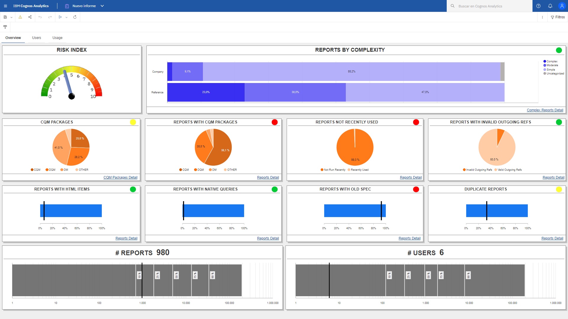
Other visualizations give you a quick picture of the areas of your Cognos environment which may require additional effort: complexity of the reports and CQM vs DQM packages. These metrics are also benchmarked against other Cognos organizations so you can compare your organization to others based on number of reports and number of users.
You see the big picture, but where do you start? Before you touch anything, consider how you can reduce the scope of the project. Conveniently, there are metrics on the dashboard to help you address that, too. Pie charts show the percent of reports not used recently and duplicate reports. If you can move these groups of reports out of scope, you’ve cut your overall work effort significantly.
The weeds. You may be saying, “I can see that a good number of reports are duplicates, but what are they and where are they? Click on the drill-through link to see a list of duplicate reports. Likewise, there’s a detailed report for reports not run recently. With this information in hand, you can tell MotioCI to delete the content that you won’t be migrating.
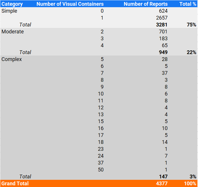
With a leaner, lighter Cognos content store, you might want to re-run the dashboard. This time focus on the level of difficulty that your team might have in upgrading. The challenges in upgrading reports are usually directly related to the complexity of the reports themselves. The Reports by Complexity visualization shows the proportion of reports that are simple, moderate and complex based on a number of factors. It also offers a comparison of the same metric to other Cognos installs.
Success Factor Number 2. Drilling in, you might see that 75% of your reports are simple. The upgrade of these reports should be straightforward. 3% of reports are complex. These, not so much. Adjust your budget and timeline estimates accordingly.
You might also want to focus your attention on specific reports that might require some special attention. Traditionally, there has been more work in upgrading reports with HTML items (potentially with Java Script), reports with native queries instead of leveraging the model, or old reports created several Cognos versions ago.
Don’t overlook the reports with no visual containers. What’s going on there? These reports are under “Simple” because they have 0 visual containers, but they may hide potential pitfalls. These may be unfinished reports, or they may be non-standard reports which need “eyes-on” attention. The report helps you focus on what is important.
Success Factor Number 3. Create a project in MotioCI for each of those types of reports. Create test cases. Establish a baseline. Compare the performance and values in each environment. You will see immediately what fails to upgrade and where performance has decreased. Fix what needs to be fixed.
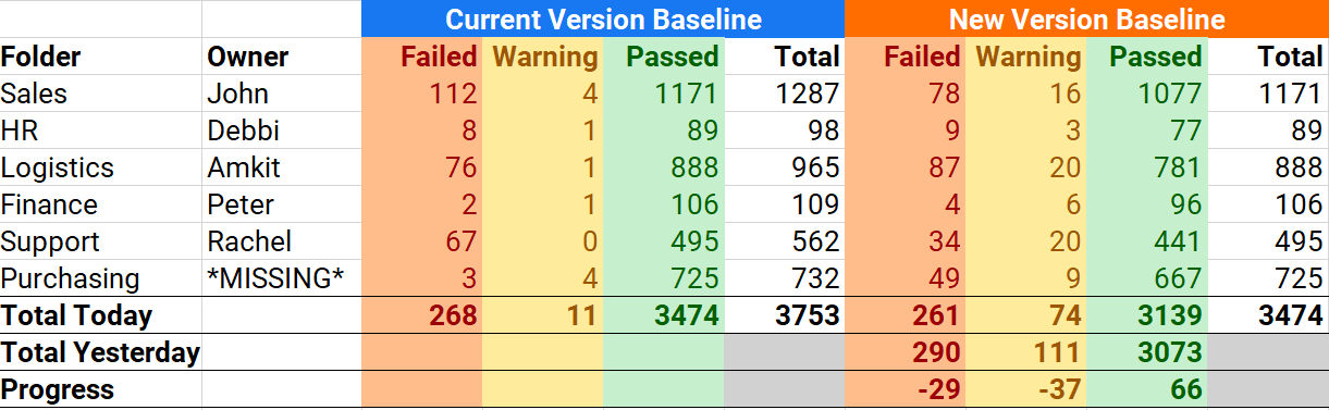
Manage the Progress. Your project manager will love the summary reports that show where reports are still failing. To manage the project, there’s a burndown report that charts day-to-day progress and estimates the date of project completion.
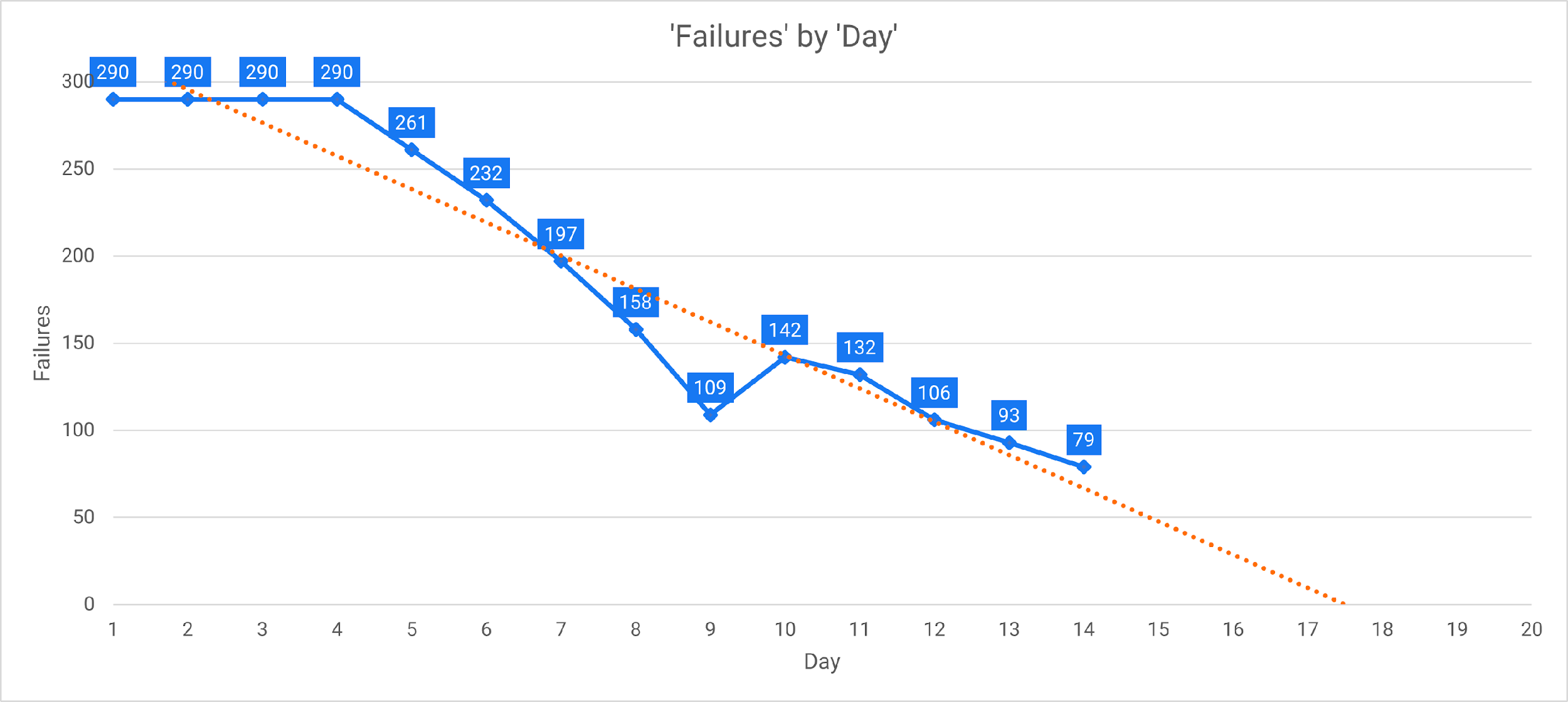
You can see from this burndown chart that if the team keeps the current pace, the upgrade testing will be completed by day 18.
So, in three reports, you managed your Cognos upgrade from end-to-end.
- The Inventory Dashboard is the guidepost to help you a) identify content, b) reduce scope and c) focus on areas critical to the upgrade.
- The Detailed Content report provides a comprehensive look at the success or failure of all the test cases related to the upgrade project. You get a quick overview of project areas that you need to focus on in the next few days.
- The Burndown report forecasts how much longer your team can expect to work the fixes related to the upgrade.
What could be better? Understand your risks before you start. Work less by reducing scope. Work smarter by focusing on the areas of importance. Manage the process intelligently by looking forward and projecting your anticipated end date. Overall, it’s a success formula to save time and money on your next Cognos upgrade.