12 Reasons for Failure In Analytics And Business Intelligence
Number 9 may surprise you
In analytics and business intelligence, there are a lot of things that can go wrong. We are, after all, looking for the single version of the truth. Whether it’s a report or a project – for the data and results to come out consistent, verifiable, accurate and, most important of all, accepted by the end user – there are a lot of links to the chain that have to be right. The practice of Continuous Integration, invented by software developers and borrowed by the analytics and business intelligence community, is an attempt to catch mistakes or errors early.
Still, mistakes creep into the final product. Why is it wrong? Here are some excuses reasons why the dashboard is wrong, or the project failed.
- It will be faster. Yes, this is probably true. It’s a matter of tradeoffs. Which do you prefer? Do you want it fast or do you want it done right?
 To be honest, sometimes we’re put in that position. I need it by Friday. I need it today. No, I needed it yesterday. The boss didn’t ask how long it would take. He told us how long we had to do it. Because that’s when Sales needs it. Because that’s when the customer wants it.
 - It will be good enough. Perfection is impossible and besides perfection is the enemy of good. The inventor of the air raid early warning radar proposed a “cult of the imperfect”. His philosophy was “Always strive to give the military the third best because the best is impossible and second best is always too late.” We’ll leave the cult of the imperfect for the military. I think the point of agile, incremental progress toward the end result is missed here. In the Agile methodology, there is the concept of a Minimum Viable Product (MVP). The key word here is viable. It’s not dead on arrival and it’s not done. What you have is a waypoint on the journey to a successful destination.
- It will be cheaper. Not really. Not in the long run. It always costs more to fix it later. It’s cheaper to do it right the first time.
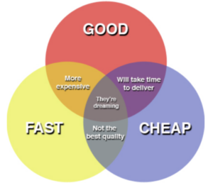
 For every step removed from the initial coding, the cost is an order of magnitude higher. This reason is related to the first one, speed of delivery. The three sides of the project management triangle are scope, cost, and duration. You can’t change one without affecting the others. The same principle applies here: pick two. Good. Fast. Cheap. https://www.pyragraph.com/2013/05/good-fast-cheap-you-can-only-pick-two/
 - It’s only a POC. It’s not like we’re going to put this Proof of Concept into production, right? This one is about setting expectations appropriately. A POC is typically time-bound with a specific set of objectives or use cases to evaluate the application or environment. Those use cases represent critical must-haves or common patterns. So, the POC evaluation, by definition, is a slice of the larger pie on which we can base further decisions. It is rarely never a good idea to put a POC into production, whether it’s software or hardware.
- It’s only temporary.
 If the results are wrong, it performs poorly, or it’s just plain ugly, it should not have escaped to production. Even if this is an interim output, it needs to be presentable. End users and stakeholders will not accept this. The caveat is, though, it may be acceptable if these are the expectations that have been set as part of the process. “The numbers are right, but we’d like your feedback on the colors in the dashboard.” Still, this should not be in production; it should be in a lower environment. Too often, “it’s only temporary” becomes the good intentions of a permanent problem.
 - This is the only way I know. Sometimes there is more than one right answer. And, sometimes there is more than one path to get to a destination. Sometimes we bring our old habits with us. They die hard. Use this as a learning moment. Learn the right way. Take the time. Ask for help.
- This is the way we’ve always done it. This one is hard to fix and it’s hard to argue with. It takes real organizational change management to change processes and the people who perform them. Often, a new project, new software, an upgrade or a migration, will expose long hidden issues. It’s time to change.
- Oops, I did it again.
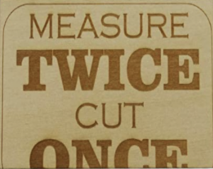
 I’m a woodworker and we have a motto because so many mistakes are made: measure twice and cut once. I know this aphorism. I repeat it to myself. But, I am embarrassed to say, there are still times when my board comes up too short. Is this carelessness? Perhaps. More often than not, though, it’s just something quick and easy. I don’t really need a plan. But, you know what? If I had taken the time to draw it out on a plan, chances are good that the numbers would have been worked out. The piece too short might have been on paper and an eraser would have fixed it. The same is true of analytics and business intelligence, a plan – even for something quick and easy – can reduce these kinds of mistakes.
 - Distractions. Looking but not seeing. Inattentional Blindness. You might have seen the video where you are given a task to do, like count the number of basketball passes for one team. While you are distracted performing that simple task, [SPOILER ALERT] you fail to notice the moon-walking gorilla. I knew what was going to happen and I still would have made a terrible witness if a crime had been committed. The same thing happens in developing reports. The requirements call for a pixel-perfect alignment, the logo has to be up to date, the legal disclaimer must be included. Don’t let that distract you from making sure the calculations validate.
- You intended to.
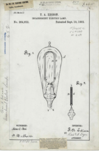
 Or, expected to. At the very least, it was always an option. Thomas Edison famously said “I have not failed. I’ve just found ten thousand ways that won’t work.” His philosophy was that with every failure, he was one step closer to success. In a sense, he planned to fail. He was ruling out possibilities. He only resorted to trial and error when he ran out of theories. I don’t have over a thousand patents to my name like Edison, but I think we may have better approaches for developing analytics or reports. (Thomas Edison Patent Application for Incandescent Electric Lamp 1882.)
 - Stupidity. Don’t deny it. This exists. Stupidity lies somewhere between “You intended to” and “Oops”. This type of epic failure is the watch-this-hold-my-beer, Darwin Award variety. So, maybe, sometimes alcohol is involved. Fortunately, in our profession, as far as I know, a drunken dashboard never killed anyone. But, if it’s all the same to you, if you work in a nuclear power plant, please do your analytics sober.
- Success doesn’t matter.
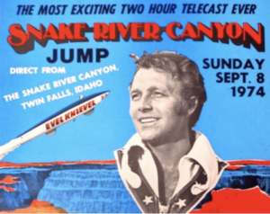
 Legendary stuntman Evil Knievel got paid for performing death-defying stunts. Success or failure – whether he stuck the landing, or not – he got a check. His goal was to survive. Unless you get compensated for broken bones – Knievel had the Guiness World Record for most broken bones in a lifetime – success does matter.


