
Analytics Lie
The Bias of Analysis
Mark Twain debatably said something like, “There are three kinds of lies: lies, damned lies and analytics.”
We take for granted that analytics gives us useful, actionable insights. What we often don’t realize is how our own biases and those of others influence the answers we’re given by even the most sophisticated software and systems. Sometimes, we may be manipulated dishonestly, but, more commonly, it may be subtle and unconscious biases that creep into our analytics. The motivation behind biased analytics is manyfold. Sometimes the impartial results we expect from science are influenced by 1) subtle choices in how the data is presented, 2) inconsistent or non-representative data, 3) how AI systems are trained, 4) the ignorance, incompetence of researchers or others trying to tell the story, 5) the analysis itself.
The Presentation is Biased
Some of the lies are easier to spot than others. When you know what to look for you may more easily detect potentially misleading graphs and charts.
There are at least five ways to misleadingly display data: 1) Show a limited data set, 2). Show unrelated correlations, 3) Show data inaccurately, 4) Show data unconventionally, or 5). Show data over-simplified.
Show a limited data set
Limiting the data, or hand selecting a non-random section of the data can often tell a story that is not consistent with the big picture. Bad sampling, or cherry picking, is when the analyst uses a non-representative sample to represent a larger group.
In March 2020, Georgia’s Department of Public Health published this chart as part of its daily status report. It actually raises more questions than it answers.
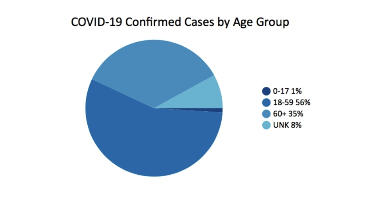
One of the things that is missing is context. For example, it would be helpful to know what the percentage of the population is for each age group. Another issue with the simple-looking pie chart is the uneven age groups. The 0-17 has 18 years, 18-59 has 42, 60+ is open ended, but has around 40 years. The conclusion, given this chart alone, is that the majority of cases are in the 18-59 year old age group. The 60+ year old age group looks to be less severely affected by COVID cases. But this isn’t the whole story.
For comparison, this different data set on the CDC web site charts COVID cases by age group with the additional data on the percentage of US Population that is in each age range.
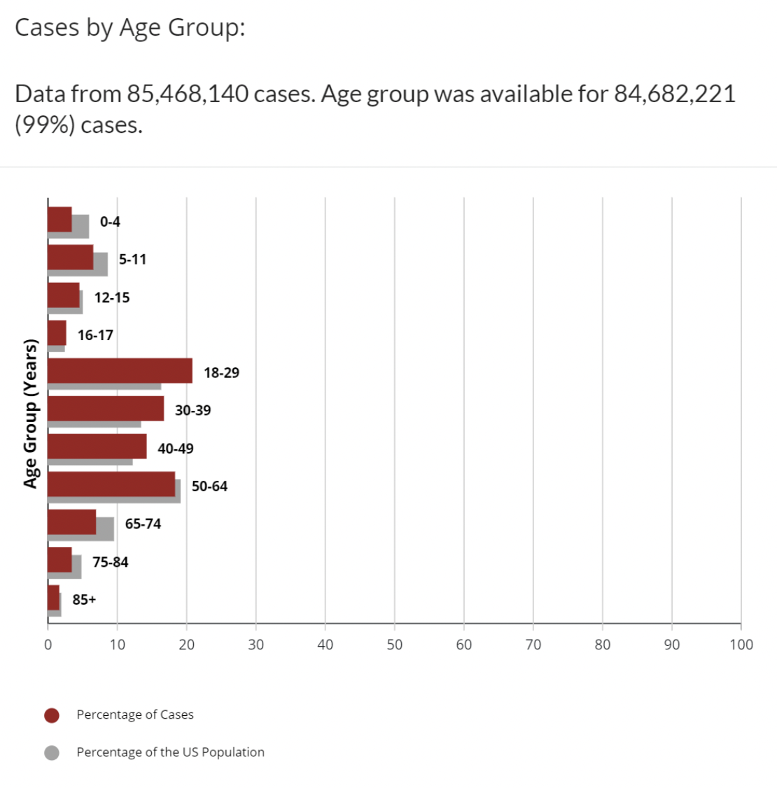
This is better. We have more context. We can see that age groups 18-29, 30-39, 40-49 all have a higher percentage of cases than the percentage of the age group in the population. There are still some uneven age groupings. Why is 16-17 a separate age group? Still this is not the whole story, but pundits have written columns, made predictions and mandates on less than this. Obviously, with COVID, there are many variables in addition to age that affect being counted as a positive case: vaccination status, availability of tests, number of times tested, comorbidities, and many others. Number of cases, itself, provides an incomplete picture. Most experts also look at Number of deaths, or percentages of deaths per 100,000 population, or case-fatalities to look at how COVID affects each age group.
Show unrelated correlations
Obviously, there is a strong correlation between US spending on science, space, and technology and the number of Suicides by hanging, strangulation and suffocation. The Correlation is 99.79%, nearly a perfect match.
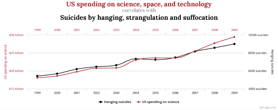
Who, though, would make the case that these are somehow related, or one causes the other? There are other less extreme examples, but no less spurious. There is a similar strong correlation between Letters in Winning Word of Scripps National Spelling Bee and Number of People Killed by Venomous Spiders. Coincidence? You decide.
Another way to chart this data that may be less misleading would be to include zero on both of the Y-axes.
Show data inaccurately
From How to Display Data Badly, the US State of Georgia presented the Top 5 Counties with the Greatest Number of Confirmed COVID-19 Cases.
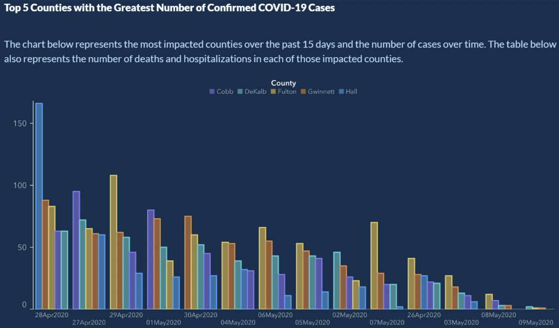
Looks legit, right? There is clearly a downward trend of confirmed COVID-19 cases. Can you read the X-axis? The X-axis represents time. Typically, dates will increase from left to right. Here, we see a little time travel on the X-axis:
4/28/2020
4/27/2020
4/29/2020
5/1/2020
4/30/2020
5/4/2020
5/6/2020
5/5/2020
5/2/22020 …
Wait? What? The X-axis is not sorted chronologically. So, as nice as the trend might look, we can’t draw any conclusions. If the dates are ordered, the bars for the number of cases shows more of a sawtooth pattern than any kind of a trend.
The easy fix here is to sort the dates the way a calendar does.
Show data unconventionally
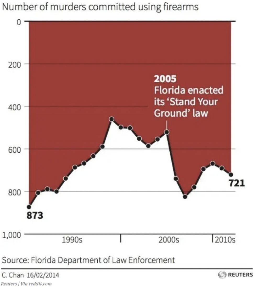
We’re all busy. Our brains have taught us to make quick judgements based on assumptions which have been consistent in our world. For example, every graph I have ever seen shows the x- and y- axes meeting at zero, or lowest values. Looking at this chart briefly, what conclusions can you draw about the effect of Florida’s “Stand your ground law.”? I’m ashamed to admit it, but this graph fooled me at first. Your eye is conveniently drawn to the text and arrow in the middle of the graphic. Down is up in this graph. It may not be a lie – the data is all right there. But, I have to think that it’s meant to deceive. If you haven’t seen it yet, zero on the y-axis is at the top. So, as data trends down, that means more deaths. This chart shows that the number of murders using firearms increased after 2005, indicated by the trend going down.
Show the data over-simplified
One example of over-simplification of the data can be seen when analysts take advantage of Simpson’s Paradox. This is a phenomenon that occurs when aggregated data appears to demonstrate a different conclusion than when it is separated into subsets. This trap is easy to fall into when looking at high-level aggregated percentages. One of the clearest illustrations of Simpson’s Paradox at work is related to batting averages.
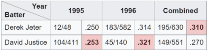
Here we see that Derek Jeter has a higher overall batting average than David Justice for 1995 and 1996 seasons. The paradox comes in when we realize that Justice bested Jeter in batting average both of those years. If you look carefully, it makes sense when you realize that Jeter had roughly 4x more at-bats (the denominator) in 1996 at a .007 lower average in 1996. Whereas, Justice had roughly 10x the number of at-bats at only .003 higher average in 1995.
The presentation appears straightforward, but Simpson’s Paradox, wittingly, or unwittingly, has led to incorrect conclusions. Recently, there have been examples of Simpson’s Paradox in the news and on social media related to vaccines and COVID mortality. One chart shows a line graph comparing death rates between vaccinated and unvaccinated for people aged 10-59 years old. The chart demonstrates that the unvaccinated consistently have a lower mortality rate. What’s going on here?
The issue is similar to the one we see with batting averages. The denominator in this case is the number of individuals in each age group. The graph combines groups which have different outcomes. If we look at the older age group, 50-59 , separately, we see that the vaccinated fare better. Likewise, if we look at 10-49, we also see that the vaccinated fare better. Paradoxically, when looking at the combined set, unvaccinated appear to have a worse outcome. In this way, you’re able to make a case for opposite arguments using the data.
The Data is Biased
Data cannot always be trusted. Even in the scientific community, over a third of researchers surveyed admitted to “questionable research practices.” Another research fraud detective says, “There is very likely much more fraud in data – tables, line graphs, sequencing data [– than we are actually discovering]. Anyone sitting at their kitchen table can put some numbers in a spreadsheet and make a line graph which looks convincing.”
This first example looks like someone did just that. I’m not saying this is fraud, but as a survey, it just does not generate any data that contributes to an informed decision. It looks like the survey asked respondents about their opinion of gas station coffee, or some other relevant current event..
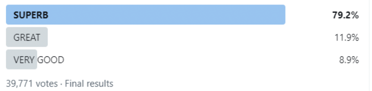
- Superb
- Great
- Very good
I’ve cropped the Twitter post to remove references to the guilty party, but this is the actual entire chart of final results of the survey. Surveys like this are not uncommon. Obviously, any chart created from the data resulting from the responses will show the coffee in question is not to be missed.
The problem is that if you had been given this survey and didn’t find a response that fit your thinking, you would skip the survey. This may be an extreme example of how untrustworthy data can be created. Poor survey design, however, can lead to fewer responses and those who do respond have only one opinion, it’s just a matter of degree. The data is biased.
This second example of data bias is from the files of “Worst COVID 19 Misleading Graphs.”
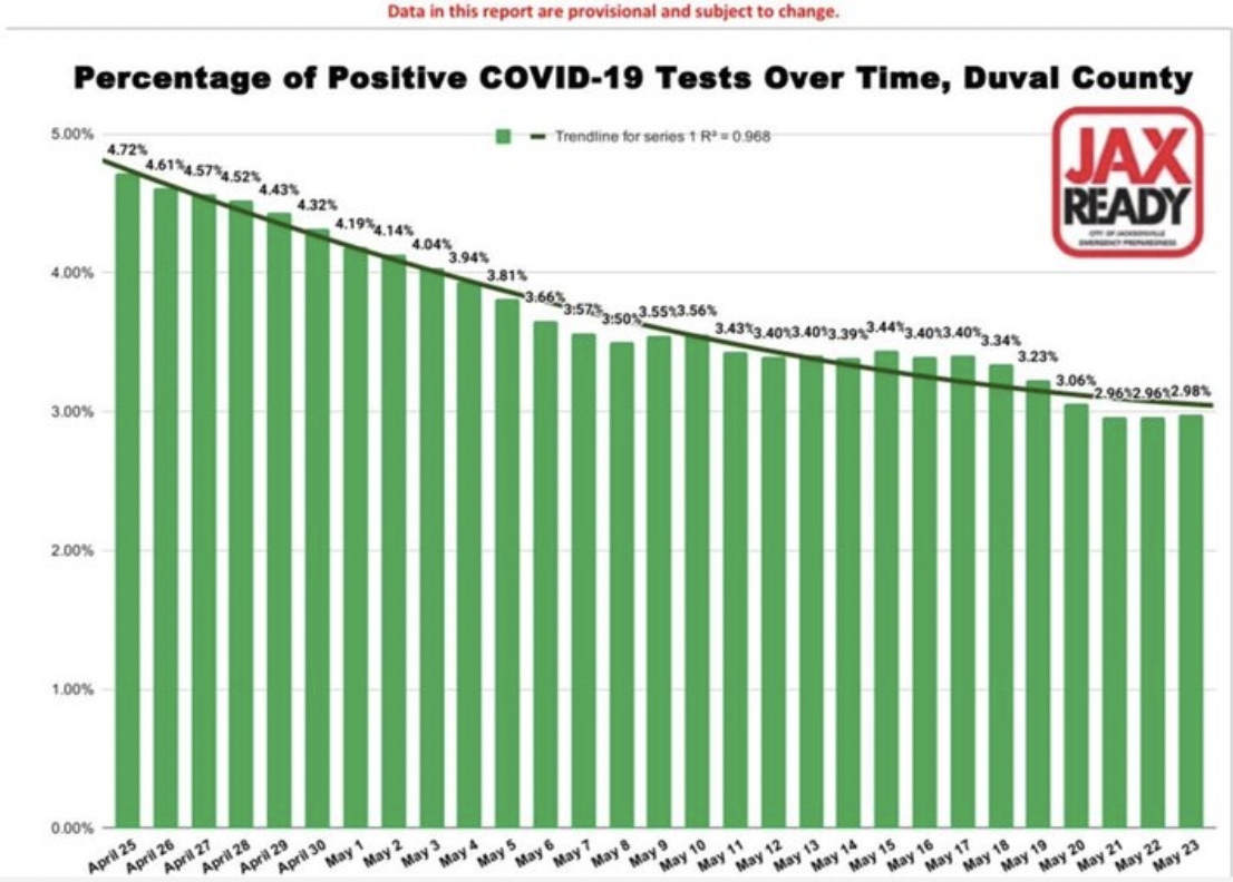
Again, this is subtle and not completely obvious. The bar graph shows a smooth – almost too smooth – decline in the percentage of positive COVID-19 cases over time for a county in Florida. You could easily draw the conclusion that cases are declining. That’s great, the visualization accurately represents the data. The problem is in the data. So, it’s a more insidious bias because you can’t see it. It’s baked into the data. The questions that you need to ask, include, who is being tested? In other words, what is the denominator, or the population of which we are looking at a percentage. The assumption is that it is the entire population, or at least, a representative sample.
However, during this period, in this county, tests were only given to a limited number of people. They had to have COVID-like symptoms, or had traveled recently to a country on the list of hot spots. Additionally confounding the results is the fact that each positive test got counted and each negative test got counted. Typically, when an individual tested positive, they would test again when the virus had run its course and would test negative. So, in a sense, for each positive case, there is a negative test case which cancels it out. The vast majority of tests are negative and each individual’s negative tests were counted. You can see how the data is biased and not particularly useful for making decisions.
AI Input and Training is Biased
There are at least two ways in which AI can lead to biased results: starting with biased data, or using biased algorithms to process valid data.
Biased Input
Many of us are under the impression that AI can be trusted to crunch the numbers, apply its algorithms, and spit out a reliable analysis of the data. Artificial Intelligence can only be as smart as it is trained. If the data on which it is trained is imperfect, the results or conclusions will not be able to be trusted, either. Similar to the case above of survey bias, there are a number of ways in which data can be biased in machine learning:.
- Sample bias – the training dataset is not representative of the whole population.
- Exclusion bias – sometimes what appear to be outliers are actually valid, or, where we draw the line on what to include (zip codes, dates, etc).
- Measurement bias – the convention is to always measure from the center and bottom of the meniscus, for example, when measuring liquids in volumetric flasks or test tubes (except mercury.)
- Recall bias – when research depends on participants’ memory.
- Observer bias – scientists, like all humans, are more inclined to see what they expect to see.
- Sexist and racist bias – sex or race may be over- or under- represented.
- Association bias – the data reinforces stereotypes
For AI to return reliable results, its training data needs to represent the real world. As we’ve discussed in a previous blog article, the preparation of data is critical and like any other data project. Unreliable data can teach machine learning systems the wrong lesson and will result in the wrong conclusion. That said, “All data is biased. This is not paranoia. This is fact.” – Dr. Sanjiv M. Narayan, Stanford University School of Medicine.
Using biased data for training has led to a number of notable AI failures. (Examples here and here, research here..)
Biased Algorithms
An algorithm is a set of rules that accept an input and creates output to answer a business problem. They’re often well-defined decision trees. Algorithms feel like black boxes. Nobody is sure how they work, ofen, not even the companies that use them. Oh, and they’re often proprietary. Their mysterious and complex nature is one of the reasons why biased algorithms are so insidious. .
Consider AI algorithms in medicine, HR or finance which takes race into consideration. If race is a factor, the algorithm cannot be racially blind. This is not theoretical. Problems like these have been discovered in the real world using AI in hiring, ride-share, loan applications, and kidney transplants.
The bottom line is that if your data or algorithms are bad, are worse than useless, they may be dangerous. There is such a thing as an “algorithmic audit.” The goal is to help organizations identify the potential risks related to the algorithm as it relates to fairness, bias and discrimination. Elsewhere, Facebook is using AI to fight bias in AI.
People are Biased
We have people on both sides of the equation. People are preparing the analysis and people are receiving the information. There are researchers and there are readers. In any communication, there can be problems in the transmission or reception.
Take weather, for example. What does “a chance of rain” mean? First, what do meteorologists mean when they say there is a chance of rain? According to the US government National Weather Service, a chance of rain, or what they call Probability of Precipitation (PoP), is one of the least understood elements in a weather forecast. It does have a standard definition: “The probability of precipitation is simply a statistical probability of 0.01″ inch [sic] of [sic] more of precipitation at a given area in the given forecast area in the time period specified.” The “given area” is the forecast area, or broadcast area. That means that the official Probability of Precipitation depends on the confidence that it will rain somewhere in the area and the percent of the area that will get wet. In other words, if the meteorologist is confident that it is going to rain in the forecast area (Confidence = 100%), then the PoP represents the portion of the area that will receive rain.

Paris Street; Rainy Day,Gustave Caillebotte (1848-1894) Chicago Art Institute Public Domain
The chance of rain depends on both confidence and area. I did not know that. I suspect other people don’t know that, either. About 75% of the population does not accurately understand how PoP is calculated, or what it’s meant to represent. So, are we being fooled, or, is this a problem of perception. Let’s call it precipitation perception. Do we blame the weather forecaster? To be fair, there is some confusion among weather forecasters, too. In one survey, 43% of meteorologists surveyed said that there is very little consistency in the definition of PoP.
The Analysis Itself is Biased
Of the five influencing factors, the analysis itself may be the most surprising. In scientific research that results in a reviewed paper being published, typically a theory is hypothesized, methods are defined to test the hypothesis, data is collected, then the data is analyzed. The type of analysis that is done and how it is done is underappreciated in how it affects the conclusions. In a paper published earlier this year (January 2022), in the International Journal of Cancer, the authors evaluated whether results of randomized controlled trials and retrospective observational studies. Their findings concluded, that,
By varying analytic choices in comparative effectiveness research, we generated contrary outcomes. Our results suggest that some retrospective observational studies may find a treatment improves outcomes for patients, while another similar study may find it does not, simply based on analytical choices.
In the past, when reading a scientific journal article, if you’re like me, you may have thought that the results or conclusions are all about the data. Now, it appears that the results, or whether the initial hypothesis is confirmed or refuted may also depend on the method of analysis.
Another study found similar results. The article, Many Analysts, One Data Set: Making Transparent How Variations in Analytic Choices Affect Results, describes how they gave the same data set to 29 different teams to analyze. Data analysis is often seen as a strict, well-defined process which leads to a single conclusion.
Despite methodologists’ remonstrations, it is easy to overlook the fact that results may depend on the chosen analytic strategy, which itself is imbued with theory, assumptions, and choice points. In many cases, there are many reasonable (and many unreasonable) approaches to evaluating data that bear on a research question.
The researchers crowd-sourced the analysis of the data and came to the conclusion that all research includes subjective decisions – including which type of analysis to use – which can affect the ultimate outcome of the study..
The recommendation of another researcher who analyzed the above study is to be cautious when using a single paper in making decisions or drawing conclusions.
Addressing Bias in Analytics
This is simply meant to be a cautionary tale. Knowledge can protect us from being taken in by scams. The more aware of possible methods a scanner might use to fool us, the less likely we are to be taken in, say, by, say, a pickpocket’s misdirection, or the smooth talk of a Ponzi play. So it is with understanding and recognizing potential biases that affect our analytics. If we are aware of potential influences, we might be able to present the story better and ultimately make better decisions.