
One of the many strengths of the IBM Cognos Business Intelligence 10.2.2 release is that it leverages the successful new capabilities introduced in Cognos 10.2.1
We will highlight what for some on the development side may be the most important additions to the already amazing Cognos 10 suite.
Liven Up Your Data
One of the most important principles in report design is making the data come alive for your end user community. Lists and cross tab reports are sometimes required but the key to seeing what is really hidden in your data needs an appropriate visualization. The Rapidly Adaptive Visualization Engine , also known as (RAVE) has delivered this ability! You can deliver insight and understanding with charts that are not only aesthetically appealing but also interactive.
Additionally, previously released versions of Cognos 10.2 included the capability of Automatic Chart Recommendation. With a simple click in the widget toolbar, you give IBM Cognos Workspace the power to analyze your data and suggest the best visualization type to bring the data to life. NEW in IBM Cognos 10.2.2 is the ability to consume additional types of interactive charts including:
- Polar Area
- Chord
- Tornado
- Combination
- Marimekko
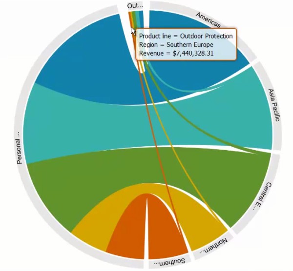
Chord Chart
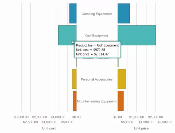
Tornado Chart
Along with these new and innovative chart types, report developers now have the ability to change key property values for a chart and use only the data slots on a chart needed to make the data come alive.
User Enhancements for Active Reports
If the new RAVE visualizations bring the message in your data to life, Active Reports add the magic of interactivity to the data. Released in earlier versions of Cognos 10, Active Reports have become a standard delivery option to business users across the enterprise. New in Cognos 10.2.2 is the capability to interact directly with the charts and have those selections directly drive additional detailed information. Now you can create a completely interactive user experience in a single place!
For the developers of Active Reports, Cognos 10.2.2 provides the ability to deliver an Active Report in HTML format, meaning you can leverage these insights across multiple browser platforms.
Possibly more important to you, as a Cognos developer, is the ability to see the report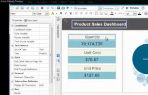 output as you are developing it. Gone are the days of making a change, creating the output and having to leave Report Studio just to see if the new colored font looks as you expected. You are even able to see a form factor representation of your Active Report directly in Report Studio. Imagine the time savings in development cycles when creating your next Active Report!
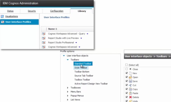
Customize User/Group UI
Within Cognos Workspace, the ability to manage several capabilities at a user or group level, has been available for some time. Now administrators can control more than just things like: print, drill up or down on data, add slider controls, or leveraging the widget toolbar. You now have the ability to create a unique user experience for specific groups within your application community.
Also new in Cognos 10.2.2 is the ability to control studio UI elements and control default behaviors including items like Toolbars, Menu Bars, Chart Types and other items. This capability will allow you to create a custom experience based on the specifics of your user community.
Improvements to Dynamic Cubes
Dynamic Cubes, introduced in earlier releases have come into their own. If you haven’t implemented a cube strategy for your applications, now is the perfect time to investigate Dynamic Cubes.
These in memory, blazing-fast data repositories offer another path for providing relevant data to your business users. They are the perfect data source for Workspace and Workspace Advanced applications as well as many standard reports.
Until Cognos 10.2.2, understanding the capacity planning for such a robust, in-memory capability, caused some to shy away. In the Cognos 10.2.2 release that concern is no longer valid. You now have a Cube Designer Hardware Sizing capability. This “sizer” analyzes your dynamic cubes and will make appropriate hardware recommendations based on the average number of anticipated users and an average number of widgets.
Ease Administrative Duties with Multi-tenancy
Multi-tenancy has often been overlooked as something only required if managing Cognos applications to user communities outside of an organization and more for customer facing applications and not internal facing. With the new capabilities added in Cognos 10.2.2, this idea should be re-examined.
Capabilities like Delegated Tenant Administration and Multi-tenancy BoundingSets can ease the administration for multiple applications and allow for a reduction in the number of physical environments.
No longer are administration tasks in the sole domain of System Administrators. Each environment can have their own Tenant Administrator or a single administrator can manage multiple tenants. Additionally, content which is required for all tenants can now be shared across the ecosystem, again reducing administrative overhead.
If you would like to explore these new features in Cognos, log into https://www.analyticszone.com and give Cognos 10.2.2 a try!