How I Debug Power BI Semantic Models When the Numbers Lie
A practical, field-tested technique for finding broken relationships in a Power BI semantic model, using a tool you already have open.
The KPI was wrong
You know the message before you even read it. “Hey, the number on the dashboard looks off. Some values are coming back blank. Can you take a look?”
So you look. You open the report, click into the card, and check the field well. The measure is there. You click the chart beside it: axis from the calendar table, values from a measure table, nothing weird. And the number is still wrong.
If you’ve built Power BI models for any length of time, your stomach already knows what’s coming. The visual checks out, which means the problem isn’t in front of you. It’s underneath you, hiding in the relationships.
The visual is almost never the actual problem. Nine times out of ten, it’s just the messenger faithfully reporting a lie that started in your relationships.
So you stop poking at the chart, accept what you already know, and do the thing you’ve been quietly dreading. You open the Model View.
Then I opened the Model View
Have you ever heard of knot theory or the famous string-in-a-box experiment? Drop a handful of string in a box, shake it, open the lid, and a thousand times out of a thousand, it comes out an impossible knot. That’s a mature Power BI semantic model the moment you open Model View to debug it. This is the feeling. Where do you even start?
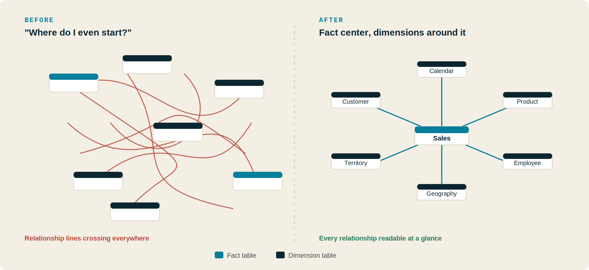
Before and after: the same model as a tangled default layout, then dragged into a clean star schema.
For a long time, this is where I stalled. The busier a model got, the more useless the view felt. What’s the point of a diagram you can’t read? That changed after a guest speaker at a DFW Power BI user group walked through this exact problem and did something so simple I almost dismissed it. I’ll get to it. First, the mindset, because the technique doesn’t work without it.
You’re playing detective
You’re not reading documentation; you’re working a case. The broken visual isn’t your problem; it’s your clue. “The Total Revenue KPI shows a blank value when I apply the Region filter” isn’t a complaint. It’s a lead. And it already names two suspects: Revenue and Region.
From there, you follow the trail backward. Which value is wrong, and what feeds it? Which tables do those fields live in? Trace back through the relationships, hop by hop, asking the only question that matters: is there a connection here that shouldn’t exist? The clue comes from the visual. The resolution comes from the model. The only thing in your way is that you can’t read the model yet.
One simple change made everything easier
Here’s the move. Drag your tables into a star schema by hand. Fact tables to one side, dimension tables fanned around them, anything unconnected (your measures table, an orphaned lookup) parked in a corner. That’s the right-hand side of the diagram above.
Moving tables in the Model View is purely cosmetic. It changes nothing in the model. It’s the single safest debugging step in all of Power BI.
The model gets cleaner with every table you move. And one tip I’d tattoo on a junior developer: collapse all your tables. By default, each card shows every column. Collapsed, Power BI shows only the columns actually in a relationship, so you go from a wall of field names to a clean diagram of join keys and nothing else. Real models give you more than one fact table, so you’ll end up with a small constellation rather than a single star. That’s fine. It still reads.
What the layout drags into the light
Now the technique stops being tidying and starts being debugging, because a clean star makes three specific modeling sins impossible to miss.
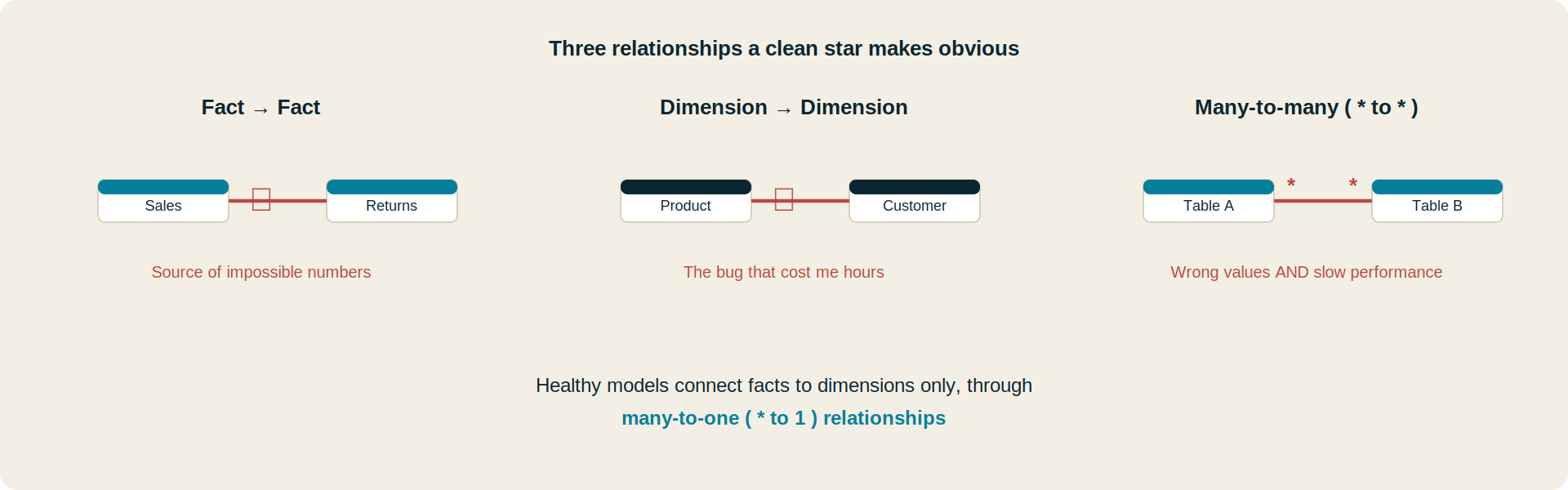
The three relationships a clean star layout exposes at a glance.
That middle one cost me real time once. Strange values in a report, no obvious cause, and it turned out I’d accidentally wired a direct relationship between Product and Customer. Two-dimensional tables that should never have touched. Laid out as a star, that one illegal line jumps out in seconds. Buried in a tangle, it cost me hours. As for many-to-many: you can use them occasionally with good reason, but they can cause both incorrect values and slow performance. If a report is correct but crawling, count your many-to-manys before anything else.
One thing that is not a bug: a dimension that feeds another dimension before reaching the fact. That’s a snowflake schema, a normal expansion you’ll meet constantly.
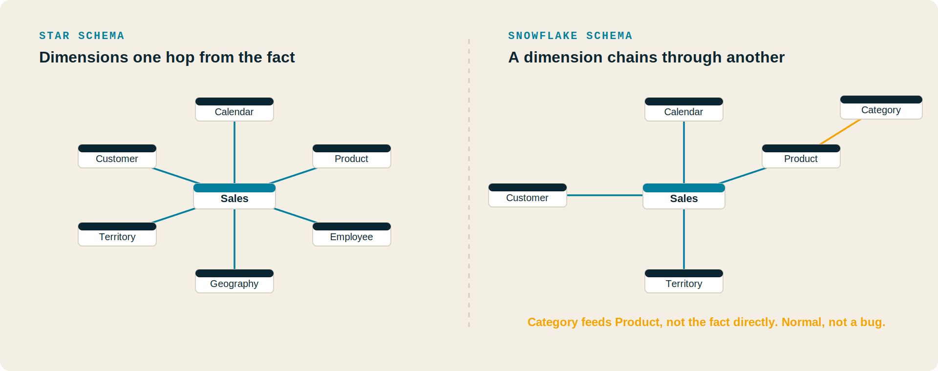
Star versus snowflake. The snowflake’s extra hop is normal, not a defect.
The relationship that shouldn’t have existed
Textbook three-table models are easy. Here’s the one that tested this.
We have an internal demo dashboard (built around Soterre) that started as a clean one-pager. Then the questions started: can we also show this? Yes. And this? Yes. Every time, yes. It metastasized into a sprawling report covering DAX catalogs, object usage, and lineage, genuinely complex because the domain is. A DAX expression can belong to a report or a dataset; a dataset can connect to an artifact or a workspace. Tangled by nature.
When a Model View looks genuinely impossible, that’s usually the model telling you the report is doing too much.
I was asked to add one more field. It kept not working: blanks, wrong values, the familiar pattern. I knew it wasn’t the visual. So I dragged the whole thing into a star, facts together, dimensions out, everything collapsed.
And there it was. Two separate fact tables with a relationship running directly between them (rule one, broken), and that relationship was many-to-many (rule three, broken). One illegal line doing double damage: garbage values and a performance drag, sitting exactly where the checklist says to look. In the tangle, it was invisible. In the star, it was the one thing that obviously didn’t belong. Diagnosis took maybe an hour, most of that the layout work itself. The same bug in the unorganized view could have eaten a full day.
Why this changed how I debug Power BI Semantic Models
Most developers open the Model View for one reason: to create a relationship. Then they close it.
The Model View is one of the most underused debugging tools in Power BI. We treat it like documentation. It’s not. It’s an active instrument for finding what’s broken.
Organizing your model is part of debugging, not a chore you do first. And underneath it all is the habit of separating two problems that look identical from the dashboard: a wrong number is a wrong number whether it lives in the visual or the model, but they’re different bugs in different places. Check the visual briefly, then go to the model and stop second-guessing the chart.
Does it take patience? Yes. But most of the intimidation is the layout, not the complexity. The knot looks impossible right up until you start untangling it, and then it’s just string.
If you live inside large, long-lived models the way I do, that kind of structural visibility stops being a nice-to-have. It’s the same problem space we work in at Motio with Soterre. But you need none of that to use this technique. The star layout is free, built in, and sitting in your Model View right now.
Lessons Every BI Developer Should Remember
- The visual usually isn’t the problem; nine times out of ten a wrong KPI traces back to the relationships.
- The Model View is a debugging tool, not documentation. Organizing the model is the debugging.
- Collapse your tables to show only relationship columns.
- Three rules a clean star makes obvious: no fact-to-fact, no dimension-to-dimension, avoid many-to-many.
- A snowflake schema is fine; it’s a normal expansion, not a bug.
- An overwhelming model is a diagnosis: the report is probably doing too much.
- You’re playing detective. The broken visual is the clue; the organized model is where you follow it.
Frequently Asked Questions
Why are my Power BI KPI values wrong when the visual looks correct?
Because the visual usually isn’t the source. About nine times out of ten, a wrong or blank KPI traces back to the relationships in your semantic model. Verify the visual’s fields and filters briefly, then move into the Model View.
How do I start debugging a complex Power BI semantic model?
Reorganize the Model View into a star schema by hand: fact tables to one side, dimension tables around them, unconnected tables parked aside. Moving tables is purely visual and changes nothing in the model.
What relationships should I avoid in a Power BI semantic model?
Direct relationships between two fact tables, direct relationships between two dimension tables, and many-to-many relationships. The first two commonly produce incorrect values; many-to-many can cause both wrong values and performance problems.
Is a snowflake schema bad in Power BI?
No. A snowflake schema, where a dimension connects to another dimension before reaching a fact table, is a normal pattern as models grow. It’s an expanded star, not a defect.
Why is my Power BI report slow even though the numbers are correct?
Performance problems with correct output often point to many-to-many relationships. Lay the model out as a star and count them first.
Does moving tables in the Model View change my data model?
No. Repositioning tables is cosmetic only. No relationships, data, or calculations are affected, which is why it’s a safe first step.